
Visual Aesthetics: Optimizing your Web Design for Maximal Visual Appeal
We’re going to say what everyone is thinking, but is too polite to admit outside of anonymous comment boxes: the majority of websites out there look like junk.
Back when sites like Myspace, AskJeeves, and Geocities were all the rage, the consumer Internet was still in its relative infancy. We didn’t understand the principles of proper web design, and we didn’t care. Horribly cluttered UIs. Unintuitive navigation. Auto-playing browser-based music applications. Bless our hearts, we didn’t know any better. Once the benefits of a good looking website became clear, the industry made a drastic shift away from the clutter into the chic, minimalist designs that we see today.
With optimized web design having transitioned from “luxury” to “necessity”, let’s look at a few simple ways you can get the most out of your website’s visual aesthetic.
Visual Design Basics
So, you want to learn how to optimize your UI to create a stunning page and leave your competition in the dust? You came to the right place. Let’s start by covering a few design essentials to kick off your website overhaul:
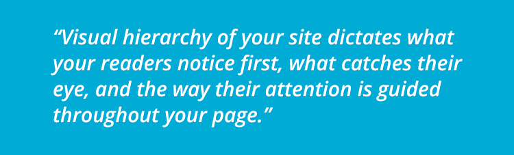
Visual Hierarchy: This idea relates to the way your readers view web elements displayed on your site. Every aspect of your web design relates to this concept. Much like it sounds, the visual hierarchy of your site dictates what your readers notice first, what catches their eye, and the way their attention is guided throughout your page. Optimizing your visual hierarchy relies on understanding how each piece of the design puzzle works together to create an engaging site:
- Text Placement: We’ve all seen text-heavy pages, and most of us hate them. Huge, unbroken blocks of text are a chore to read. For the best visual appeal, balance your text on the page and make liberal use of headings, bullet lists, and formatting tools that make text easier for our brains to process.
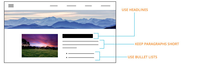
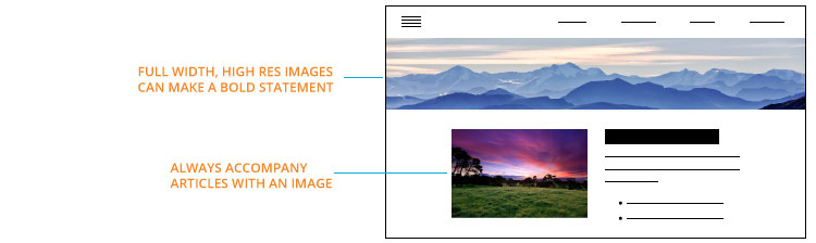
- Image use: Pictures and images draw the human eye more easily than text. Chances are, if you include images, graphs, or infographics on your site, your viewer will peruse them before reading the novel typed out beside them. Place these strategically to keep your readers engaged as they scroll, and to support your text where necessary.
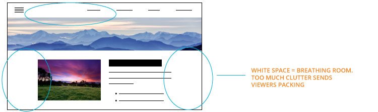
- White Space: Closely tied with text placement and image use, the overall white space of your page must be balanced. Too little and you’re back to the cluttered designs of the 90s. Too much, and your site looks empty and uninteresting. Coordinate your text and visuals throughout your page to create a pleasing balance of white space and content.
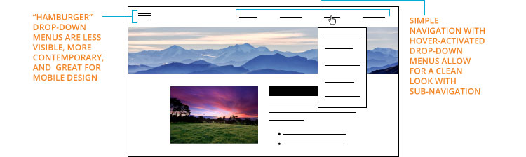
- Navigation: Balancing navigation tools is tricky. Common practice used to be to provide links in huge lists on the side of the page; visible, yes, but not particularly attractive. The Windows 10 upgrade made a big transition towards those “hamburger” drop-down menus that hide in the corner of the screen. Less visible, but more contemporary. Finding the right navigation style may depend on how complex your site is and what role your other content plays in your visual hierarchy.
Successful Design
While the trends of visual web design are still developing, you can’t ignore the principles of basic visual appeal in our Internet-centric world. The visual style that works best for each brand is unique, and often requires trial and error before you get it right. If you’re frustrated with your current web design, speak with a web design boutique for an audit of your site’s strengths and weaknesses. Sometimes, a professional touch is all your site needs to rocket it from a 90s nightmare into the aesthetic designs of the future.