
Simple vs. Flashy Web Design
Obviously websites aren’t birds, but you get the analogy. Yes, peacocks are gorgeous and draw attention; They also distract. Flashy web design does the same thing.
Do you remember when flashy websites, glittery images, and migraine-inducing color schemes were all the rage? So do we—the year was 2000, and everyone was so relieved to have survived Y2K that we clearly weren’t paying attention to the state of our web design. In the modern age of consumer choice, cluttered and flashy web design formats are more than enough to drive your audience away.
Simplify Your Style
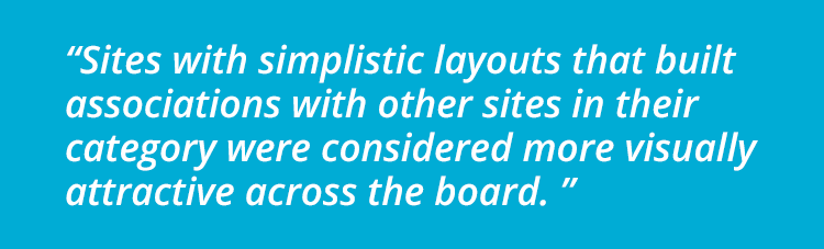
Consider this study by Google on the visual complexity of websites. They found that when it came to first impressions, websites with simple interfaces were perceived as much more visually appealing than their complex counterparts. On top of that, the study showed that sites with simplistic layouts that built associations with other sites in their category were considered more visually attractive across the board. This type of decisioning is instant, occurring in as little as 1/20th of a second!
First impressions are critical in our overall assessments of style, yet so many websites are still missing the mark when it comes to their website design.
You’re Doing It Wrong
All it takes is a few examples of visual design gone wrong to demonstrate how important a professionally-made website is.
Consider the site of the Chicago Bone and Joint Center. While they’re clearly going for an informational approach designed to provide as many patient resources as possible, the sheer number of things going on makes navigation a chore. Let’s not even discuss the distracting rainbow flash header. Imagine how much better this site would be with a more professional and clean style that prioritized building authority and confidence in their surgical clinic.
However, you must be careful about going too far with this concept. This website is an example of taking the minimalism idea to the extreme. What do they even do? Why is there a walk icon image next to a statue? It seems like they’re related to startups in some way, but you have to do some real digging before you actually find the details. Kiss your consumer engagement goodbye.
Visual Design
Screen real estate is valuable. It’s natural to want to maximize your website’s available space and put as much value-driving content in as possible. However, maximizing isn’t the same thing as optimizing. Visual design is as much art as it is science; it requires a delicate balance of imagery, text, and white space for the most appeal. More often than not, businesses opt to go too far with their content and end up with site designs that are complicated, cluttered, and a headache to navigate.
This isn’t just detrimental to your user’s experience—it’s detrimental to every aspect of your online presence. It’s distracting, it slows down page loading, and increases the complexity of mobile viewing and screen orientation shifts. This is exact opposite of what quality websites strive for, and is an absolute killer of ecommerce, sales, and conversion rates.
Finding the Sweet Spot
Clearly, there’s a happy medium that must be reached for optimal web design. Your site is supposed to help your users find answers to their problems, so why make it harder than it has to be?
Whether your goal is to provide information, make sales, or generate an audience for your material, simplicity of design nearly always wins out over complexity. We’re a culture of short attention spans and unlimited options—take the stress out of the decision-making and work with a qualified web developer who can best optimize the visual design of your site.